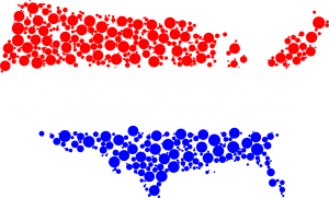
If you’ve been paying attention to the last few days worth of news, you’ll notice that many political outlets have been release hypothetical voting maps based on a varying array of demographics, using census data, poll information and probably lots of hyperbolic nonsense that has no basis on factuality. Such sensational voting maps we saw were: “What if only white men voted?” and the wonderful “What if blacks and women were never allowed to vote?” which were essentially two ways of saying the same thing.
The major media outlets apparently have become so bored with actual voting data that they’ve decided to inundate us with hypothetical situations that will never happen unless we go back in time and change history to be much worse than it has already become.
In light of this wonderful new method of making up news on a slow news day, we’ve taken to creating a few voting maps of our own using no real information, statistics we completely made up and information that is as arbitrary as your poly-sci degree, since you’re still just an assistant manager at Staples.
First up: “What voting would look like if we painted all the states one color.”
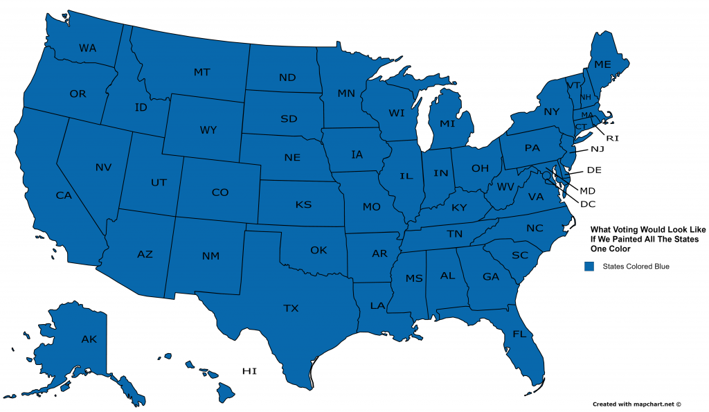
This effective map shows just what kind of world we would live in if we sent thousands of airplanes into the sky and just dropped blue paint on everything. It’s a very effective map as you can see, it would totally really change the scope of every two colored map you’ve ever laid your eyes upon. All of those maps would now be full of useless, fake data, just like they already are.
Next up: “What Voting Looks Like Based On Which Crappy Song They Dance To At Weddings”
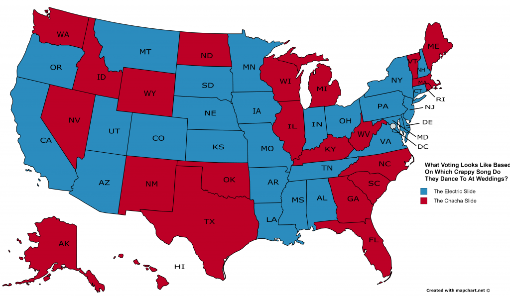
What really strikes us about this map, is that it is much like the actual current voting maps in that, no matter which state you’re in, you’re going to be goddamn miserable. Both of those songs are hot garbage and no one wants to hear or dance to them, willingly. If it wasn’t for all of that free alcohol and because most of your family sucks at actually dancing, no one would ever do this crap to themselves. It also serves to remind people, you can never underestimate the power of large groups of people doing something stupid.
Finally: “What if only dinosaurs voted?”
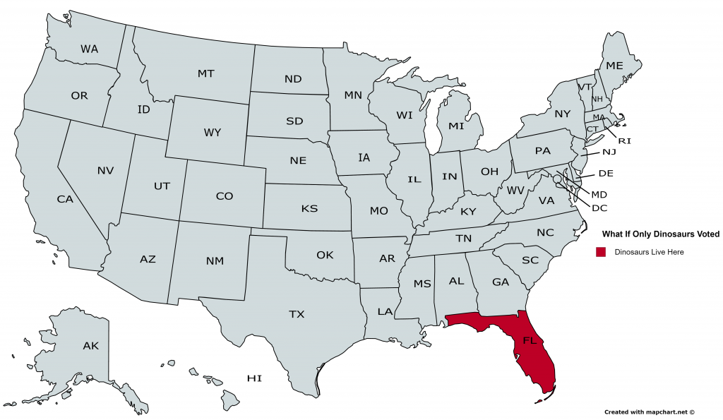
This is absolutely my favorite of our new extrapolated maps. We’re not exactly sure if this means that there is a dinosaur left in the Everglades that no one knew about all this time, or if all the gators count as dinosaurs. Or is it maybe that since so many old people live there that this map is not taking things so literally? I don’t know but I also don’t care. A world where only dinosaurs get to vote is obviously not a fun world for us to live in, but it’s just as viable of a sample study as any of the other really stupid maps that we keep seeing. So please, share this with all your friends to make sure that this never happens in the United States.
There you have it. All voting scenarios are now counted for but I’m fairly certain more silly maps will be seen in the coming days. Don’t let them scare you into voting. I’m sure you’re already scared enough.